In common control they are various control show here:
Common
Properties of the Check Boxes and Radio Buttons


Button control:
ASP .Net provides three types of
button controls: buttons, link buttons and image buttons. As the names suggest
a button displays text within a rectangular area, a link button displays text
that looks like a hyperlink. And an Image Button displays an image.
When a user clicks a button control,
two events are raised Click and Command.
Basic syntax for button controls:
<asp:Button ID="Button1"
runat="server"
onclick="Button1_Click" Text="Click" />
|
Common Properties of the Button
control:
Property
|
Description
|
Text
|
The text displayed by the button.
This is for button and link button controls only.
|
ImageUrl
|
For image button control only. The
image to be displayed for the button.
|
AlternateText
|
For image button control only. The
text to be displayed if the browser can't display the image.
|
CausesValidation
|
Determines whether page validation
occurs when a user clicks the button. The default is true.
|
CommandName
|
A string value that's passed to
the Command event when a user clicks the button.
|
CommandArgument
|
A string value that's passed to
the Command event when a user clicks the button.
|
PostBackUrl
|
The URL of the page that should be
requested when the user clicks the button.
|
Text Boxes and Labels:
Text box controls are typically used
to accept input from the user. A text box control can accept one or more lines
to text depending upon the setting of the TextMode attribute.
Label controls provide an easy way
to display text which can be changed from one execution of a page to the next.
If you want to display a text that does not change, you use the literal text.
Basic syntax for text controls:
<asp:TextBox ID="txtstate"
runat="server" ></asp:TextBox
|
Common Properties of the Text Box
and Labels:
Property
|
Description
|
TextMode
|
Specifies the type of text box.
SingleLine creates a standard text box, MultiLIne creates a text box that
accepts more than one line of text and the Password causes the characters
that are entered to be masked. The default is SingleLine.
|
Text
|
The text content of the text box
|
MaxLength
|
The maximum number of characters
that can be entered into the text box.
|
Wrap
|
It determines whether or not text
wraps automatically for multi-line text box; default is true.
|
ReadOnly
|
Determines whether the user can
change the text in the box; default is false, i.e., the user can change the
text.
|
Columns
|
The width of the text box in
characters. The actual width is determined based on the font that's used for
the text entry
|
Rows
|
The height of a multi-line text
box in lines. The default value is 0, means a single line text box.
|
Checkbox and RadioButton:
A check box displays a single option
that the user can either check or uncheck and radio buttons present a group of
options from which the user can select just one option.
To create a group of radio buttons,
you specify the same name for the GroupName attribute of each radio button in
the group. If more than one group is required in a single form specify a
different group name for each group.
If you want a check box or radio
button to be selected when it's initially displayed, set its Checked attribute
to true. If the Checked attribute is set for more than one radio button in a group,
then only the last one will be selected.
Basic syntax for check box:
<asp:CheckBox ID= "chkoption" runat=
"Server">
</asp:CheckBox>
|
Basic syntax for radio button:
<asp:RadioButton ID= "rdboption" runat=
"Server">
</asp: RadioButton>
|
Property
|
Description
|
Text
|
The text displayed next to the
check box or radio button.
|
Checked
|
Specifies whether it is selected
or not, default is false.
|
GroupName
|
Name of the group the control
belongs to.
|
Example : lable and check box
Output:
List Controls And List Item Collections:
ASP.Net provides the controls:
drop-down list, list box, radio button list, check box list and bulleted list.
These control let a user choose from one or more items from the list.
List boxes and drop-down list
contain one or more list items. These lists could be loaded either by code or
by the ListItem Collection Editor.
Basic syntax for list box control:
<asp:ListBox ID="ListBox1"
runat="server"
AutoPostBack="True"
OnSelectedIndexChanged="ListBox1_SelectedIndexChanged">
</asp:ListBox>
The ListItemCollection object is a
collection of ListItem objects. Each ListItem object represents one item in the
list. Items in a ListItemCollection are numbered from 0.
When the items into a list box are
loaded using strings like: lstcolor.Items.Add("Blue") . then both the
Text and Value properties of the list item are set to the string value you
specify. To set it differently you must create a list item object and then add
that item to the collection.
Common Properties of List Item
Collection:
|
Common methods of List Item
Collection:
Methods
|
Description
|
Add(string)
|
Adds a new item to the end of the
collection and assigns the string parameter to the Text property of the item.
|
Add(ListItem)
|
Adds a new item to the end of the
collection.
|
Insert(integer, string)
|
Inserts an item at the specified
index location in the collection, and assigns the string parameter to the
Text property of the item.
|
Insert(integer, ListItem)
|
Inserts the item at the specified
index location in the collection.
|
Remove(string)
|
Removes the item with the Text
value same as the string.
|
Remove(ListItem)
|
Removes the specified item.
|
RemoveAt(integer)
|
Removes the item at the specified
index as the integer.
|
Clear
|
Removes all the items of the
collection.
|
FindByValue(string)
|
Returns the item whose Value is
same as the string.
|
FindByValue(Text)
|
Returns the item whose Text is
same as the string.
|
Example:
Output:
Bulleted list and Number list:
The bulleted list control creates
bulleted lists or numbered lists. These controls contain a collection of
ListItem objects that could be referred to through the Items property of the
control.
Basic syntax of a bulleted list:
<asp:BulletedList ID="BulletedList1"
runat="server">
</asp:BulletedList>
|
Common Properties of the Bulleted
List:
Property
|
Description
|
BulletStyle
|
This property specifies the style
and looks of the bullets, or numbers.
|
RepeatDirection
|
It specifies the direction in
which the controls to be repeated. The values available are Horizontal and
Vertical. Default is Vertical
|
RepeatColumns
|
It specifies the number of columns
to use when repeating the controls; default is 0.
|
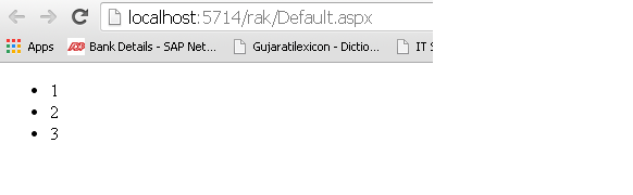
Example:
Output:
File Uploading:
With ASP.NET , accepting file uploads from users has become extremely easy.File Upload control,it can be done with a small amount of code lines, see in following example.
<body>
<form id="form1" runat="server">
</head>
<div>
<asp:FileUpload ID="FileUpload1" runat="server" />
</div>
<p>
<asp:Button ID="Button1" runat="server" onclick="Button1_Click" Text="Button" />
</p>
</form>
</body>
Example:
Calendar:
The
calendar control is a functionally rich web control, which provides the
following capabilities
- Displaying one month at a time
- Selecting a day, a week or a month
- Selecting a range of days
- Moving from month to month
- Controlling the display of the days programmatically
The basic syntax for adding a
calendar control is:
<asp:Calender ID = "Calendar1" runat =
"server"></asp:Calender>
|
Events
|
Description
|
SelectionChanged
|
It is raised when a day, a week or
an entire month is selected
|
DayRender
|
It is raised when each data cell
of the calendar control is rendered.
|
VisibleMonthChanged
|
It is raised when user changes a
month
|
Example:
Working with calendar control:
Putting a bare-bone calendar control
without any code behind file provides a workable calendar to a site, which
shows the month and days of the year. It also allows navigating to next and
previous months.
Properties
|
Description
|
Day
|
To select a single day
|
DayWeek
|
To select a single day or an
entire week
|
DayWeekMonth
|
To select a single day, a week or
an entire month
|
None
|
Nothing can be selected
|
The syntax for selecting days:
<asp:Calender ID = "Calendar1"
runat = "server"
SelectionMode="DayWeekMonth">
</asp:Calender>
When
the selection mode is set to the value DayWeekMonth, an extra column with the
> symbol appears for selecting the week and a >> symbol appears to the
left of the days' name for selecting the month
Example:

Output:
 |


0 comments:
Post a Comment